A NEW GENERATION OF DESIGNERS FOR THE MURDER ROOM
It’s always a great honour going into colleges and universities to talk to the next generation of graphic designers and illustrators. We have a long relationship with many courses, setting varied projects from literary classics book covers to marketing campaigns. Northbrook College (part of Brighton MET) have always been really engaged, and won our nation competition a few years ago. This year we set them – what we thought! – would be one of the most challenging briefs so far.
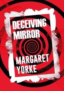
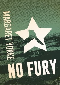
Ebooks are always complex, and even more so for students new to the field. But we couldn’t have been more impressed, the standard was excellent! Cameron, a second-year student, managed to get that nostalgic feel whilst also making them feel fresh and approachable – with the stand-out you need for an ebook. He has been a total pleasure to work with.
Lucie Stericker, Group Creative Director
When I was given the brief, I immediately began to research ebook covers and picked out key bits of information I felt were important to creating a good piece of design that stands out against the rest. I felt that because ebook covers are viewed as just a small thumbnail on a website; the text should be much clearer to read; either by enlarging the text or picking a bold font (or both!). The design should also work in black and white as most ebook readers use e-ink displays which only project shades of grey. The cover should convey the general theme of the book without being explicit and it has to be eye catching to stand out from the millions of other books available. I researched what has been done before regarding Margaret Yorke’s books; most of them seemed outdated. It was clear to me that the new covers had to be engaging and fresh for a new audience whilst retaining some retro flare as a lot of these stories were written between the 1960s and the 1980s. I did struggle for a while with what the covers should look like. If I am being honest the stories are not the sort I usually read, which made this a challenge, but I decided to use that to my advantage: I thought I should make the covers in a way that would make me personally buy them.
I liked the idea of blending photography and design to create a dynamic layout; inspired by Swiss designers like Herbert Matter and Josef Müller-Brockmann. These are reflected in my earliest sketches when I was deciding how to lay out my text in a dynamic way; you can achieve this having the text at an angle which was very common with the Swiss style. I also wanted a limited colour palette, originally all the books were going to be white, red and black but this changed as it made the collection all look the same and it was better to have the colours reflect the individual stories. Initially I wanted the photography to be black and white without any editing however I felt it looked way better when I turned the photos into a half-tone pattern. This is reminiscent of traditional letterpress printing seen in old posters which helps give the covers a retro theme. I was intending to do my own photography work but I was keen to find very specific elements that unfortunately I had no access to. The text is large and bold; designed to stand out. I used two fonts, one from the 20th century and a contemporary font, which complement each other very well. In the end, each book has a unique design but they all followed the same structure and style with each element working together to create a punchy design that stands out without being too flashy.
I was surprised to find out that I had won the competition as the other participants submitted excellent designs. I feel that competitions like this are a great way to find good designers and help them get a foot through the first door to becoming a professional. I admit I got a bit excited when I saw the covers pop up on Amazon!
Cameron Morris
 |
 |
 |
 |


